Gracon
(contractor)
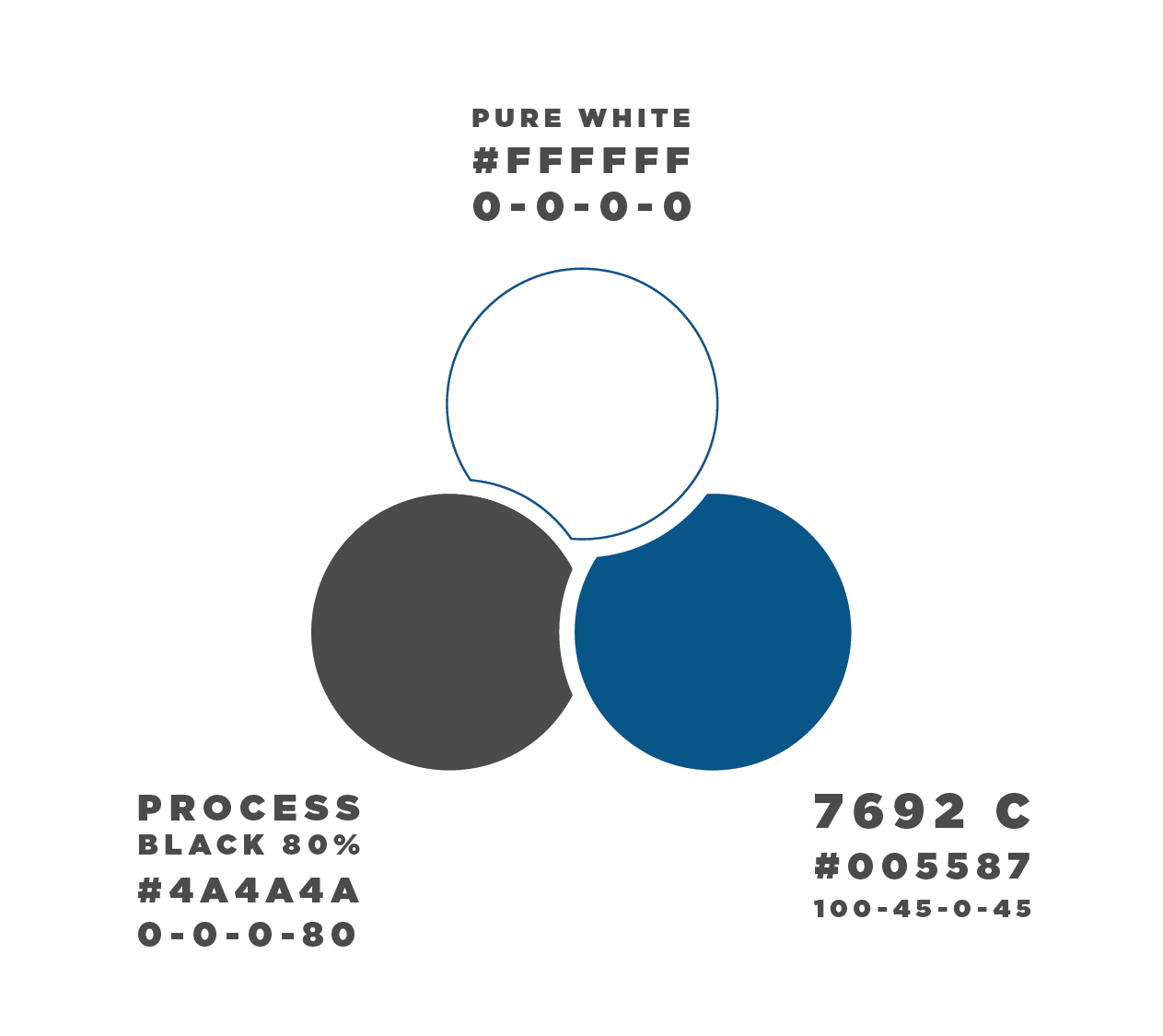
Gracon Corp, in the transition to Gracon LLC, was looking for a rebrand of their identity. As a provider of "contracting services for challenging Hydro-Electric and Dam Refurbishment Construction Projects for corporations and government agencies." the rebrand features a strong "constructed" letter G that is purposefully stencil-able. The star feature is a wrench head in the negative space locking with the inner bar of the G.
Development Test Layouts
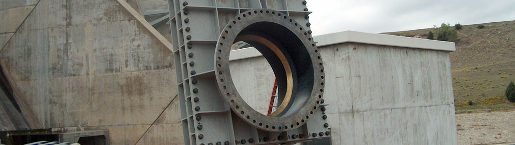
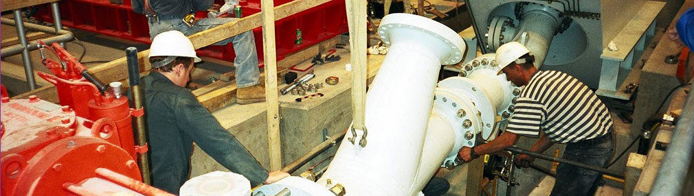
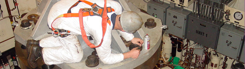
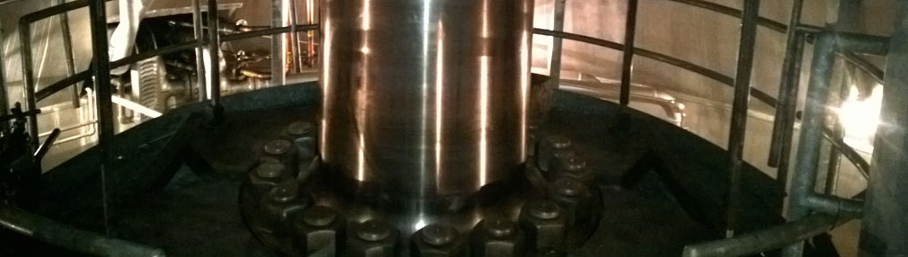
A consistent element through the companies hydro-electric work was the use of these huge nuts and bolts. This identified the wrench as the perfect tool to separate the company from homebuilding general contractors who don't use the tool as prominately.